
5 steps to turn your OKRs into logical, measurable categories of design and business health with POKRs and North Star Maps
One of my biggest struggles as a writer is sorting out whether I should separate the practical and applicable frameworks I’ve learned over the years from my core values, beliefs, and truths. I’ve spent countless hours and attempts trying to separate them in a way that felt meaningful and forthright. The reality is, I can’t and I shouldn’t.
In the real world, it’s my responsibility to write and teach what I know while including the difficult realities folks do or may face when trying to implement what they’ve learned. It would be irresponsible and selfish of me to do otherwise. So, here we go!
First things first–let's define POKRs
You're here for a reason–to know what this new acronym is all about. POKRs stands for perspectives, objectives and key results. I pronounce it as the letters P-O-K-R, but as you'll see later, it's totally appropriate to also pronounce it as "poker".

The POKR Framework by Second Wave Dive is a framework to translate OKR methodology into clear, understandable tasks and initiatives.
POKRs is a goal-setting methodology to help individuals, teams, and organizations define measurable goals. POKRs add an additional element (perspectives) to a traditional OKR methodology, creating a logical cause-and-effect connection between strategic objectives. The framework is all about adding quality factors that different individuals or teams think about when making decisions so they can intentionally track and measure those factors. Quality factors may include accessibility, ease, equity, adoption, learning, beauty, efficiency, sustainability, revenue, etc.
When we add Perspectives to traditional OKRs, we have a model to pose a question like, “What does accessibility have to do with adoption?”. This additional framing allows teams to intentionally set objectives and metrics for both the reasons why customers use a product and why that’s important to the company. This framing helps product teams better figure out the types of initiatives or tasks needed to do their jobs well.
There’s much more to the framework, but first, I'd like to share something else first.
Skip to the five steps if you don’t want to read this personal journey stuff.
In 2009, I was challenged to do something seemingly simple—recreate the scorecards of measures and metrics my colleagues at Apple were using.
My colleagues used scorecards to track and monitor the impact of their decisions on key business measures. As it turned out, they wanted to know how my decisions also affected the outcomes they were reporting on. While I had been involved with big product decisions, I wasn't very good at articulating how my decisions correlated to the outcomes they were reporting on. So, I accepted the challenge.
My goal was to track and monitor the impact of my decisions on key business measures. Rather than starting from scratch, I started with the scorecard and measured what my colleagues were already using, and looked for other approaches designers used to do this sort of work. I remixed a couple of different models and found a solution that worked pretty well!
And then, I left Apple.
I found none of the other companies I've worked for since have tracked and monitored their decisions in the same way or with the same rigor. When I tried introducing my scorecard approach, it failed miserably because none of the other companies talked about scorecards. They were talking about OKRs. They weren't just talking. They were excited about OKRs and thought they'd solve everything.
And yet… when I looked deeper, there wasn't much beyond the talk. OKRs appeared in keynote presentations and town-hall events, but very few leaders and teams were rigorously trying to implement them. Instead, the high-level OKR talk was good enough, and when I came flying in on my high horse with measuring and scorecards, it freaked many people out.
And so, I had to start all over again.
Super quick summary of OKRs by me
If you're reading this, you have heard about OKRs. There's a lot of information about OKRs out there, so rather than give a detailed summary of what they are, here's my take:
Objectives and Key Results is a goal-setting methodology. It's a structure that companies and teams use to define what they want to happen (objective) and how they'll know it's happening (key results). But, more put, it's how many companies and teams try to prioritize what they're working on.
While the narrative around OKRs is quite familiar, do you know the origin story beyond the narrative?
If you don't know the history of OKRs and how they got famous, here's a brief summary. If that summary is just too much, here's the story as five bullet points:
Another guy at Intel remixed it into something new
The second guy taught it to a third guy who came up with the name OKRs
That third guy taught it to Google in 1999 while his company was investing $12.5M for a slice of the pie
OKRs haven't just worked at Google, but quite a few other startups as well. Seeing that success and reading those success stories has led to a lot of other companies to adopt the framework. But, lots of other companies and teams aren't seeing the same success with OKRs that Google has had.
Rather than focus on why they don't work, I want to talk about some of the factors that helped OKRs work at Google in 1999. These factors that aren't included in the wildly shared story:
At the time John Doerr (third guy from above) introduced OKRs to Google, Google leadership said, "yes" because they didn't have any other framework to use.
Google, at its core, started a company that was really comfortable with measuring and tracking data.
Google was very small (only like 10-12 people), so OKRs have been there basically from the beginning
Google separated OKRs from employee performance measurement and incentives. THIS IS A BIG DEAL.
As a reader, you may be wondering why I'm sharing any of these things and why I should care. Here's my belief. I believe Google succeeded with OKRs not because of OKRs, but because of the circumstances in which they were introduced. Those factors above were just as critical to their success as the framework itself.
Over the last 20+ years, many other companies have implemented (or tried to) OKRs with varying degrees of success. Within my experience and in working with hundreds of design leaders over the past four years with Second Wave Dive, there are clear patterns around what is and isn't working.
To be clear, the insights below are based on my experiences and observations. Others may and do experience other things.
In my opinion, OKRs tend to work well for:
Startups laser-focused on one product
Organizations that do not structure themselves as multiple business units (Apple)
Companies and teams who have a deep-rooted culture of measuring, tracking, and monitoring decisions. Btw, if you notice any designers who talk about measuring, they are often surrounded by other teams who measure well. This is really the luck of the draw, not down to a framework.
In my opinion, OKRs NO NOT work well when:
When a company has a culture of people in power trusting their gut
Multiple business units with separate budgets, strategies, outcomes, etc. Lots of Enterprise companies fall into this category here.
A company has more than one product
When there is no strategy in place
When the company ties OKRs to employee performance, bonuses, promotions, etc, this is just catastrophically bad and turns everything into a competition.
In the real world, just one person can drive the type of changes to address all of the above. It’s the CEO. I'm guessing the majority of you are not CEOs, and you deserve some practical guidance on how you might begin addressing some of the gaps.
We need to redesign a known framework
In my experience, many theoretical models get introduced and fail to deliver on their promise. The same can be said of a discipline like design. It's not all bad, but in the following section, I'm hoping to evoke a sense of accomplishment with your progress, concern for new challenges, and curiosity to try new things.
Whether or not you call yourself a designer, design has been all the rage over the last 10-15 years. We sold our colleagues, companies, and industries on the idea that designing and having designers was a competitive advantage. They totally believed us.
Not only are design resources, methodologies, personalities, and best practices commonplace, they’re commonplace in places they rarely were just a few years ago, for example, in business periodicals, boardrooms, and journalism.
Design executives with titles like Chief Design Officers, VPs of Design, Heads of Design are no longer rare. Over two hundred and fifty thousand designers are making a living doing this work. That is tremendous, tremendous progress. Celebrating this progress is so important to feel energized and courageous. Why? Because you’re going to need both to keep going.
While the number of companies employing senior design leaders has doubled, most executives have indicated that design is not reaching its full potential. While we focus so much on not being seen or perceived as reaching our potential, we fail to recognize the makeup of the 90%. It’s still a bunch of white dudes.
When I look at the majority of boardrooms, the makeup of C-Suites, or at those in leadership positions, not much has changed in the last 10, 15, or 20 years. Yes, we now have great examples of leaders who challenge the norm, but by and large, that 90% is still the same voices and profiles. The same behaviors and beliefs. The same decisions and policies. The same old definition of what value is–money.
As I mentioned previously, I believe OKRs are quite good for startups who are laser-focused on building one product and getting it to the market. Other frameworks, like AARRR metrics, help teams focus on converting potential users into users. When startup teams are building products from scratch, the majority of the focus is on growth. These frameworks have helped lots of startups get initial that traction and growth.
But I have a question for you: Are you, right now, working at a startup that is laser-focused on building one product? If so, groovy! This may not be relevant, but read on anyways! If not, you may be struggling with your OKRs.
When you're working on products in any other setting, there are four issues I see coming up time and time again that OKRs aren't effectively addressing:
Teams have more than one objective to meet
Shared objectives across product teams
Quality and desirability conversations remain subjective
Designers aren't fulfilling their potential
Let’s go into each with more detail.
Teams have more than one objective to meet
“After a great kickoff meeting, the developers, designers, and PM agreed on what should be done. They were excited and enthused. Everyone headed off to do their work and eventually, had a 1:1 with their boss. At those 1:1s, the developer was told by their manager to increase their velocity. The PM was pressured by her CPO to meet adoption and revenue goals first. The designer was inspired by their team to improve accessibility across the interactions. Suddenly, they were given new directions on what should be done from those who weren’t in the room.”
What started as excitement and enthusiasm turned into frustration and anxiety. Each member of the team is now stuck between two priorities; do what was agreed as a team or do what the boss said to prioritize. When this occurs, we know there's a major failure at the leadership level, but waiting for leaders to figure this out leaves the product team to sort it out by themselves. That's messy and complicated.
TLDR: Product teams want to make something great, but members can't make sense of how velocity, accessibility, adoption, and revenue are interlinked.
OKRs are set up to cascade individual objectives and key results down and across an organization. But you live in the real world. When you're debating with your colleagues on what to do or how to do it, you face pressures to meet functional area, product, and customer objectives. You're trying to achieve more than one outcome at the same time. You're on the hook for improving satisfaction AND engagement. You're told to increase revenue AND improve accessibility.
What does velocity have to do with revenue? What does learning a skill have to do with customer satisfaction? What does accessibility have to do with usability? What does engagement have to do with adoption? OKRs do not answer these questions.
We need a framework to show how different, important objectives relate.
Shared outcomes across product teams
A few years ago, a PM asked for some help because their team was struggling with the impact of their work. The conversation went like this:
"Our team is responsible for adoption of the product. We're not seeing an increase in adoption.", confidently said the PM.
"Great! Are you responsible for the site where customers decide to use your product?", I responded.
"No. We work on the features the customers use after they've signed up.", said the PM.
"Huh. So, why are you responsible for adoption when you're working on the features that are used after adoption already occurred?", I said.
This was the first time this PM realized they had no way to impact the objectives the team was responsible for. This was the first time this PM realized the importance of having shared objectives with another team. This was the first time this PM realized their own leadership didn't have shared objectives across teams.
The majority of tech professionals that I've met or worked with have been passionate about one thing: building great products for customers. I love this passion. Yet, when different teams struggle to have shared priorities, working agreements, or collaboration across products, I have seen that passion turn into frustration in the blink of an eye.
Passion to make great things is not enough to collaborate across teams. You know how I know? Ask five different teams at the same company to define what objectives they're trying to achieve and you'll get five different answers. The reason we need shared objectives across teams is because customers deal with a variety of features multiple teams are working on. Customer don't adopt specific features that one product team is responsible for.
We need a framework to show how objectives can be shared across teams and how achieving them simultaneously is possible.
Quality and desirability conversations remain subjective
By far, the biggest issue I've experienced is what I'll call The Desirability Gap. Successful products are created when they are viable for the company, feasible for the company to make, and desirable for customers to use. Guess which factor is the source of the biggest day-to-day debates. It's desirability.
Eventually, once a product reaches a certain level of maturity, conversations move from minimally viable* towards higher quality. That's where I've seen a lot of teams running into problems.
When teams are discussing quality, everyone has an idea or opinion of what that means. It's totally healthy and valid for colleagues to share their thoughts and beliefs. The problem is, when there's no shared understanding of what quality is or what level of quality is needed, thoughts and beliefs become personal. And when making hard decisions as a team becomes personal, oh boy!
In my experience, OKRs primarily focus on viability and feasibility. This puts WAY too much emphasis on the business benefits when determining quality. Revenue, costs, satisfaction, engagement, churn, velocity, etc., are all important metrics to understand, but they're all in service to the company, not the customer. They don't tell the story of why a customer is satisfied or continue to engage, if engagement is healthy for the customer, or how to make more objective decisions as a team in regard to desirability.
Remember, product team members are passionate about making great products for customers, and great products "win" in the market. We have to add a little more objectivity to the conversation.
We need a framework to show business leaders that desirability isn't so subjective.
Designers aren't fulfilling their potential
If you're a designer, you might not like what I have to say next. Designers are a big part of this problem too.
Within many product teams, designers are the ambassadors of desirability. They have positioned themselves as the experts and have been hired to make products more human, useful, meaningful... desirable. Yet time and time again, I see designers make a fundamental mistake when on the job.
They bring their design debates to product decisions.
Companies are not hiring designers to debate what great design is with each other or with their teams. Companies hire designers to have an objective and shared POV of what great design is for the products they're working on. Companies and leaders think they're making it up when designers can't do this. Why would they trust designers with anything more than making things pretty if they think designers are making it up?
“What is desirable?”
This is one of the first questions I ask when I work with a company, consult with design teams or mentor design leaders. I have yet to ask this question and get the same answer twice.
This lack of consistency in an organization puts designers and design teams in difficult situations. Business partners expect to get the same answer to this question from every designer in a company. Why? Because designers are ambassadors of desirability for their organization.
Time and time again, I see designers on the same team or in the same organization give different interpretations of what makes a product or service desirable. This confuses business partners and makes them believe desirability is subjective—and therefore unworthy of trust in decision-making.
How do we fix this situation? In my experience, the tools we use to conduct our analysis and develop insights are too complex to share with business partners. Plus, they don’t really remove the subjectiveness of desirability. Journey Maps and Service Blueprints are incredibly powerful and useful. But they don’t directly show how improving an experience leads to objectives and goals for adoption.
So we have a communication gap. Product teams, stakeholders, and executive leadership struggle to connect the dots between desirability and adoption.
Strategy Maps are the bridge we need.
Expand traditional OKRs with categories of Design and Business heath (Perspectives) and Strategy Maps.
Strategy Maps are one of my favorite business visualizations. Simple in structure, a Strategy Map shows the relationships between organizational objectives through underlying quality perspectives. Think of perspectives as categories of health.
Strategy Maps were initially popularized in the 1990s as part of a strategic management framework called The Balanced Scorecard. Now they’re a popular tool for describing and visualizing business strategies at companies large and small.
And then OKRs came around. What teams gained by using OKRs compared to The Balanced Scorecard, they lost a sense of meaning. OKRs don’t tell us what two objectives have to do with one another, but Strategy Maps is an established framework that does.
POKRs = OKRs + Strategy Maps
To address the issues of OKRs, we remix them with Strategy Maps. The result is POKRs. There are 5 steps to get started with POKRs.
Step 1: Connect your company’s OKRs to traditional categories of business health
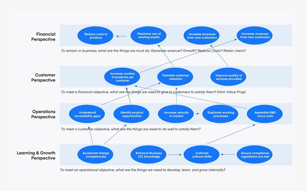
Coming from the Strategy Map framework, traditional perspectives of company health are Financial, Customer, Operations, and Learning & Growth.
Financial: To remain in business, what must we do? Generate revenue? Grow? Reduce costs? Retain users?
Customer: To meet a financial objective, what do we need to give customers to satisfy them?
Operational: To meet a customer objective, what things do we need to do well?
Learning & growth: To meet an operational objective, what are the things we need to develop, learn, and grow internally?
If we look at the current OKRs for your company, do they logically belong to one of these perspectives? In my experience, they do! For example, “developing agile skills” relates to Learning and Growth. “Velocity” is a measure of Operations. “Better customer solutions” and “generating financial value” relates to Financial health.
The order of these traditional perspectives matters because it indicates priority in trade-off decisions. Financial is at the top of the visualization, but companies become more financially healthy when they learn & grow, become more operationally efficient, and deliver customer value. To make sense of the priorities, we go in reverse order:
If we develop new skills (Learning & Growth), we think we’ll…
Become more operationally efficient (Operations). If we become more operationally efficient, we’ll…
Deliver more customer value and satisfaction (Customer). If we do that, we’ll…
Increase revenue and reduce costs (Financial).
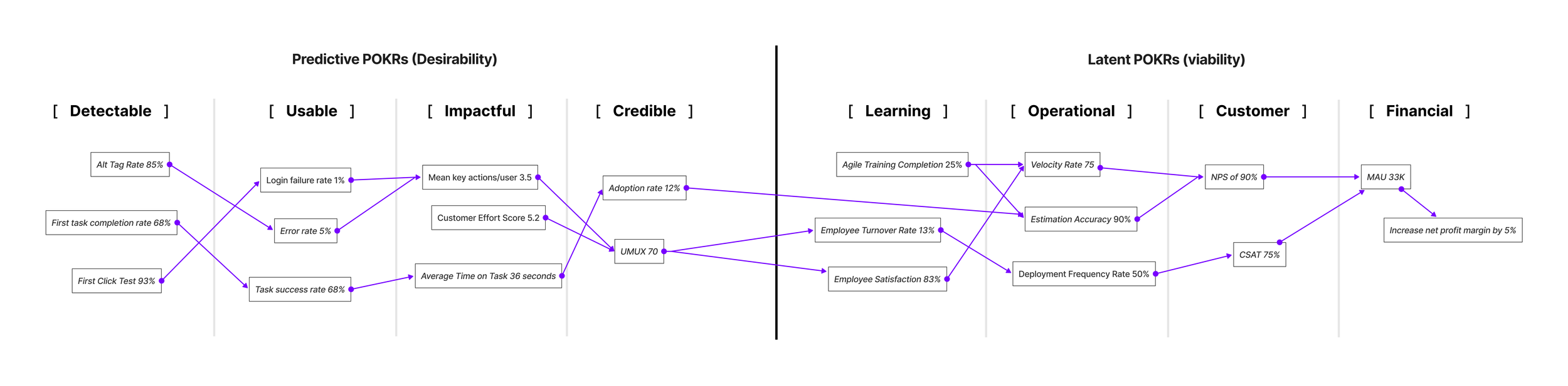
By using POKRs (OKRs + Strategy Maps), we have a visualization of the strategy, and teams also have a shared understanding of how individual decisions and choices relate to different outcomes. A final POKR Map for Viability might look something like this.
A hypothetical example for viability POKRs by Ryan Rumsey
Developing Strategy Maps is one of the most effective ways to foster the maturity of design teams. Not only do they play to our strength—visualization—but they also unite designers around a common point of view that is vastly superior to an array of personal opinions or feelings.
Now I’ll show you how to create a Strategy Map that communicates your team’s definition of desirability and helps to clarify how designers impact competitive advantage differently than other functions in the business.
While traditional Strategy Maps connect objectives between separate perspectives of company health, Desirability Strategy Maps connect creates a clear viewpoint on how separate perspectives of desirability influence product success.
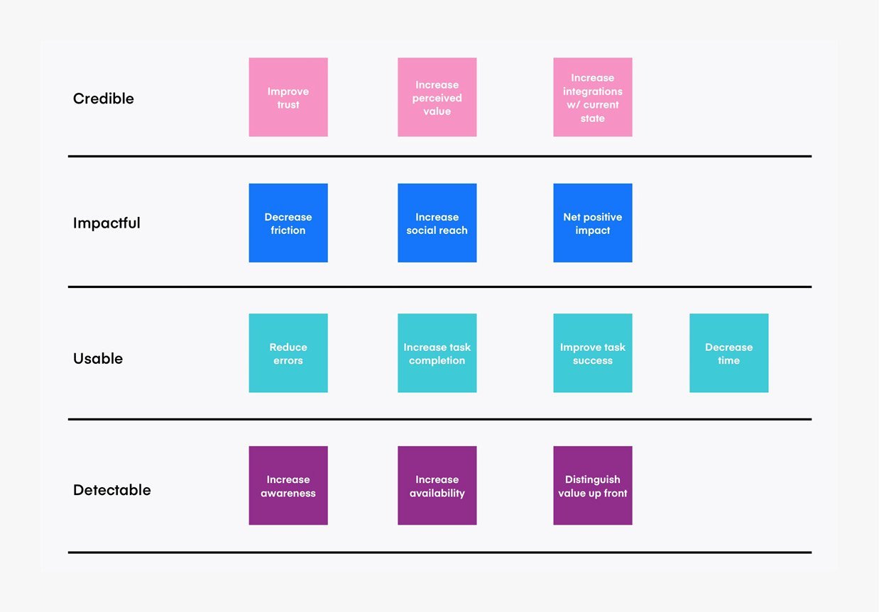
Step 3: Create categories of Desirability health
After 10 years of creating Strategy Maps for design teams, I’ve settled on a format that creates a clear viewpoint on how desirability factors influence adoption. I use only four perspectives to keep things simple for my business partners. And I’ve aligned most desirability objectives within them without any problem.
These perspectives, in order of importance, are:
Credibility: To drive adoption, what things must be credible for the customer or user? What must we provide that makes it easy for them to choose this product or service over any other option?
Impact: To meet a credibility objective, what things must create an impact for the customer or user?
Usability: To meet an impact objective, what things must be usable for the customer or user?
Detectability: To meet a usability objective, what are the things that must be detectable to the customer or user?
If you want your organization to prioritize factors like ethics or accessibility, you must first emphasize these perspectives. I place credibility above all others because trust, accuracy, or relief ultimately matter more than usability. Customers who don’t believe your product or service is credible will quickly take their business elsewhere.
This setup gives design teams an initial outlook on what is desirable for a customer: an experience that is detectable, usable, impactful, and credible as an option.
Step 4: Create Objectives for Desirability
After establishing your four perspectives, it’s time to capture two to three strategic objectives for each perspective. These objectives are where you associate values like the environment, trust, society, ethics, diversity, or inclusion with the importance of usability, functionality, or aesthetics. The easiest way to express an objective is with a phrase that combines a verb and a specific noun. For example, “improve trust,” “increase inclusion,” or “reduce errors.” Once you’ve captured your team’s goals, align each to the specific perspective with a simple chart like the one below.
As you add objectives, a more refined model of desirability emerges. But we’re not done yet. To integrate with the rest of the business, we need to link desirability to viability. We do this with two elements: arrows and conditional statements. I’ll show you how in the next section.
If we increase the number of products that meet accessibility standards (Detectable), we think we’ll…
Reduce the number of errors (Usable). If our products are more usable, we’ll…
Help customers complete tasks (Impactful). If we do that well, we’ll…
Increase the number of people choosing to use our tool (Credible).
Step 5: Map Desirability and Viability objectives to each other
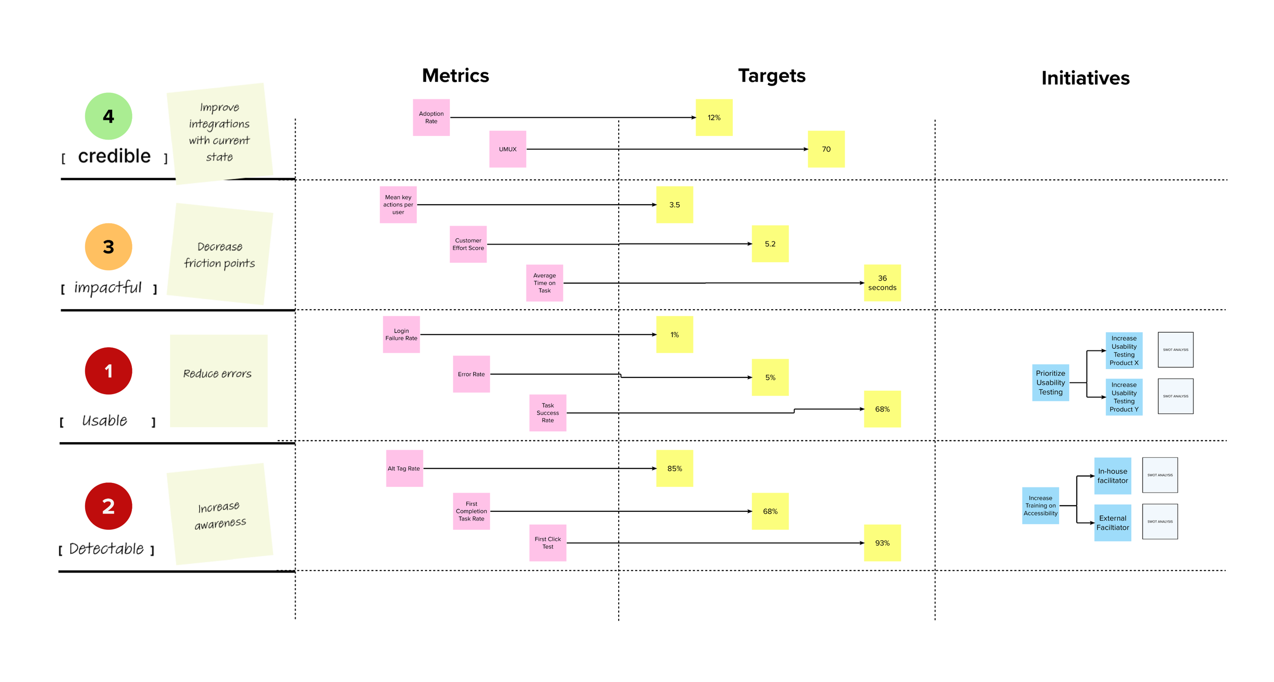
A common dilemma designers face is when a colleague who has not participated in observations provides a conclusion. When this happens, your other colleagues do what’s natural: they base their own guess on their past experiences or prior knowledge. This is problematic because it leads to inaccurate conclusions across the board and difficult political situations.
One common approach to working through this dilemma is to expose colleagues to users. But another helpful approach is to show your logical reasoning.
Conditional statements are a great way to do this. Conditional statements are formed by connecting two separate statements. The first provides a hypothesis and the second, a conclusion. If you’ve ever developed an app or written code, you’re familiar with “if/then” and “if/else.” These are examples of conditional statements. Conditional statements create a cause-and-effect model in which being successful with one statement promotes the success of the other. This is where the beauty of visual diagramming comes into place. Rather than trying to write out these statements, you can illustrate them using arrows.
To illustrate a single conditional statement, draw how you believe the objectives connect. The goal is to draw out multiple statements like this, moving from objectives at the bottom to the top. Here’s an example of how to illustrate it.
An example North Star Map from Second Wave Dive
Here’s an example of how one of these conditional statements might be written out:
“If we increase our availability, then we will increase awareness, which will reduce errors, and in turn, decrease friction to result in increased integrations.”
While it may not be perfect, it’s one complete conditional statement of why desirability matters and how specific objectives relate to overall adoption. We’ve now reached the point where we can make the breakthrough connection to viability.
Congratulations! You’ve just connected design to business and desirability to viability! These conditional statements are now the perfect set-up to frame better experiments moving forward. Our next topic— measures and metrics—comes into play in these experiments.
Simply put, Metrics are ways to track and monitor how well you’re meeting objectives
Design teams at high maturity levels find ways to quantify the value of design to the larger organization through experimentation. These teams create experiments that measure desirability and viability. They also understand that experimentation leads to active learning and the establishment of trust with their colleagues.
The key to creating good product experiments is to start with two viability goals at once: a primary goal that changes and a secondary goal that stays the same. In other words, the team wants to achieve the primary goal without losing something else.
For example: Our (primary) goal is to increase revenue while keeping costs the same (secondary). The key to creating great product experiments is to consider two viability goals AND two desirability goals simultaneously. One of my favorite methods for validating these types of experiments is described in the book Designing with Data by Elizabeth F. Churchill, Rochelle King, and Caitlin Tan. Below is a synopsis of how it works.
Using this structure, product teams have a format to shape multiple hypotheses regarding desirability factors within an experiment. While the overall purpose of each experiment is to validate whether or not a solution is viable, the purpose of testing different approaches is to validate the degree of viability in relation to desirability goals.
When it comes to measurements, we’re fortunate to have the work of many design leaders who have written on the topic. Whether we use Key Experience Indicators, Usability, Credibility, or other measures, it’s critical to track the effects of your experiments both quantitatively and qualitatively. Having an imbalance in either direction leads to a lot of guessing. If this top-down approach to experimentation seems too robust for your team’s current maturity level, there’s a simpler approach that also produces good results.